The design process for signage is a bit complicated for someone who doesn’t have a graphic design background. So, it is no wonder that we often get questions from our clients about why we ask for certain things when creating a sign. We know that our clients – from small businesses, nonprofits, and larger corporations – all need signage because signs are one of the most tangible parts of a brand. That is why giving you some basic design guidelines for signage can help your business with its next signage request.
Larger format print materials are necessary for catching attention and cultivating interest in your brand, event, or other items of interest. Using these large formats provide a lower-cost marketing alternative that many other display promotions or advertising strategies. Signs can offer a set-it and forget it mentality to attracting new clients or patrons. However, sign printing has a few practical challenges that make it somewhat different from printing smaller formats:
 So here are a few pointers on how to design and print signs that work and show well:
1) Use Vectors for your Images
The team at Pinnacle receives a large variety of file types from our clients. Often the graphics we received are raster based (or pixel based) files rather than vector images. Raster files can be used to print great signage as long as they are high resolution graphics.
However, vector files work much better for your printing needs. Why? Because using a vector image helps to prevent fuzzy pixelated issues. Vector images are made up of basic geometric shapes such as points, lines and curves. The relationship of the shapes is expressed as a mathematical equation which allows the image to scale up or down in size without losing quality. The differ from raster files which are made up of a set grid of dots called pixels where each pixel is assigned a color value. Unlike a vector image, raster images are resolution dependent which make it hard to print a good quality sign with a low-resolution file.
The bottom line is that designs that are intended for smaller prints like business cards or flyers should not be used on large format printing. Making sure that the fonts, images, colors, and patterns are all optimized for the distance they will likely be viewed is critical.
2) Use The Correct Color Settings
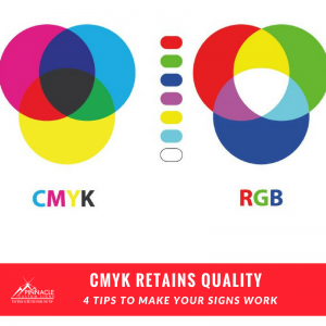 Not only should you send your files in vector format, but you should also use CMYK settings for your files. When designers create files they have the option between CMYK and RGB. CMYK provides more vibrant colors, deeper blacks, and a less complicated printing experience in your final product. Most printers use CMYK and using the correct mode will help your printed signs appear in the precise color you designed them.
3) Use the Right Image Size For Photos
Although we prefer to use vector based files, we know that photos are going to be pixel (raster based) formats. So if you are including a photo in your signage, use these guidelines to pick appropriate photos:
| Pixel Per Inch | Result |
| 100 ppi | Poor to Fair |
| 150 ppi | Fair |
| 200 ppi | Good |
| 300 ppi | Excellent |
The closer you expect the viewer to receive the information the lower the value necessary for print. However, if you want a potential viewer to be able to see signage from across the street or further down the road, 200 ppi + is the rule of thumb.
4 ) Use The Right Sign Material
 Pinnacle is experienced in knowing what materials best meet an number of different scenarios. Depending on where you’ll use them, different materials help truly make the best use of a large format medium.
Examples such as weather conditions are an important factor when deciding on materials. Yard Signs for instance, are excellent for extended outdoor use, but standard poster signs make more sense indoors. Banners can work well in both indoor and outdoor contexts and can vary based on use.
Sign location can also impact materials. Are you hanging them from posts? Do you plan on putting your sign in a window? Are you putting it on the corner of the street? Each of these options lend themselves to different material finishes. For instance, window clings can be great for small spaces with temporary application. Because they adhere right to your window, they can be a large size to make your message seen without taking up room on the sidewalk or valuable wall space. Clings are removable and reusable since they are simply attached with static cling when you intend to display your signage in a window.
Why Use a Pro?
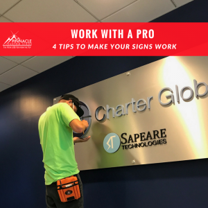 If you’ve never worked with a professional sign company before, you’ll want someone with a graphic design background to help you. Most professional companies have design professionals on staff to assist you with the final product but making sure your artwork is in the correct format can be easier if you have them on file.
It’s unlikely that car magnets and vehicle graphics will be viewed the same way, even if they are both intended to be placed on a car. The standard sizes and materials for those products, and the way another motorist will see the product are different. In the case of retail traffic, a window cling will be viewed from someone standing in front of a location whereas an A-frame can be seen by someone approaching the location. A professional sign company can help you walk through that thought process.
Pinnacle offers free consultations with our clients to discuss these needs because although we understand it may be easier to try and save or money by reusing the design your business created for your recent ad campaign – it may not be effective. Creating a design that matches your format gives you the best value. Contact us today to let us help you with the design behind your next sign project.


