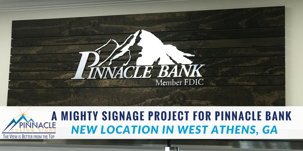
The Pinnacle Custom Signs Team was contacted by Mighty 8th Media and Pinnacle Bank back in May for a consultation about the interior signage for their newest location on the west side of Athens, GA. Pinnacle Bank has very specific and very creative brand guidelines for their properties which often makes signage challenging when they open new locations.
 Mighty 8th Media provided the creative vision for this project and met with the bank team at our office to discuss the multiple graphics needed for the new location. During our time together in our office, it was quite apparent that an on-site visit was going to be necessary to truly get the scope of the project.
Pinnacle Custom Signs made the trip out to Athens to see the new property and visualize the area where the bank was hoping to install the list of graphics. We also visited the existing Pinnacle Bank location in Braselton a few times to make sure that we created the “Signature Sign” according to brand standards.
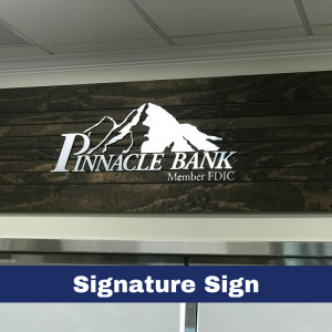
Signature Sign
Pinnacle Bank’s signature interior sign consists of a multi-level dimensional sign that has a PVC Backer with wooden slats stained a specific color to match their other locations. The PVC backer for this sign is then painted the same color as the wall to blend in and appear that the slats are applied directly to the wall.
 We created the wooden slates by using a single sheet of wood to make sure that the grains matched when applied to the PVC backer. Then the logo and text were created out of brushed aluminum veneer on PVC to keep within the bank’s budget. We adhered them to the backer using a pattern to create evenly spaced lettering. Upon completion, the sign was cleat-mounted to the wall.
Window Graphics
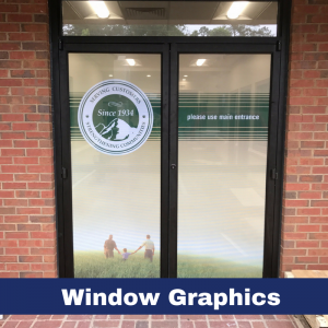
Next step of this sign project was to provide standard interior window graphics that displayed the location’s hours of operation with standard white ready to apply vinyl. The bank’s signature branded frosted vinyl stripes were applied to the front doors and windows in the office. Then we used perforated vinyl to apply branding and wayfinding directionals to the side doors that pointed customers to the front door of the building. Additional vinyl was also used on three windows in the break room of the bank.
Canvas Prints
Canvas prints for this location were completed for Pinnacle Bank in two phases. The first set of prints was completed and installed prior to the grand opening. The second phase of prints was completed after the bank’s opening.
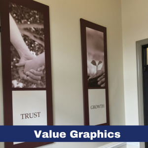
Collectively we created seven 24”x72” canvases that captured Pinnacle Bank’s values: Vision, Value, Trust, Reach, Growth, Innovative & Confidentiality. The images for these canvases were all done in sepia hues and had the value word and border in the branded burgundy color.
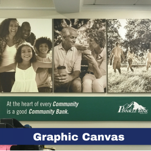
One large (5’ by 8’) “Cornerstone” canvas was created to promote how proud Pinnacle Bank is to be the cornerstone of communities they serve – both big & small. Due to the size of this canvas, we outsourced production to our partner Royal Printing Solutions. We knew that there would be a risk that the colors for an outsourced product could be slightly different but the product and quality turned out great and was installed.
Finally, two collages (one 4’ x 8’ and one 5’ x 8’) which helped to promote the bank’s services for customers and the community mission. The 5’x8’ conveyed the importance of community and used three images with a tag line on the bottom for a total of four canvas frames. The 4’x8’ collage used six panels and promoted three of Pinnacle Bank’s signature services.
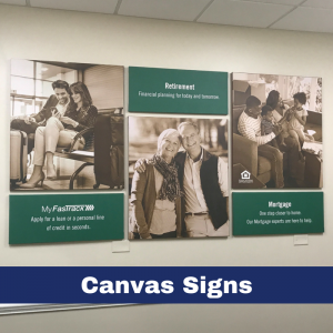
The collages presented an interesting challenge that required us to do additional work with the design team at Mighty 8th Media. We were having a tough time getting the sepia tones to be correct and printed a large quantity of samples for Mighty 8th trying to nail the design they created. We discovered in the end, that the designer had created the artwork palate in RGB settings instead of CMYK. In the design world, RGB is the palate used for screens and CMYK color utilized for print. Once we determined the problem and had the creative converted, it took little time to get these printed correctly for both the design team and the client.
Teller Pods
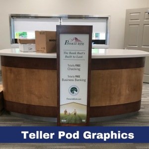 Instead of the traditional teller desks used at most bank locations, Pinnacle Bank’s new location would be installing “pods” for customers to use to do their banking. The pods provided space for graphics that would allow the branch to advertise their services. Since these services would often be changed or seasonal, we created graphics that will be easy to remove to be changed.
Banners
The last item on the checklist was creating standard banners for the location. Pinnacle Bank wanted to make sure to market their totally free checking services at the ATM and drive-thru areas.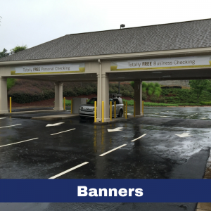
Challenging Project?
We constantly work with companies that have strict brand standards in place for their locations. We understand the process for meeting the needs of the client’s strategy, timeline, and budgets when working to open new locations. That is why we offer complimentary consultations to review the scope and specifications of your project ahead of time to ensure the quality you seek. For more information about our services, contact us to schedule a consultation to discuss the scope of your next project.


