Saint Vincent de Paul – a Catholic-based charity – serves and supports people in need of necessities such as food and power. The society’s main Atlanta headquarters has been located in Chamblee for many years. The main office is located in a rundown building across from the PDK airport and next to the Chamblee MARTA station.
While this has provided great foot traffic accessibility, it has not been as great for public image. In the facility, Saint Vincent de Paul distributes food, medicine, provides counseling and other basic services to the regional community.
However, because of the surrounding area and the look of the building, it always seemed like there was a hesitation to take advantage of the services. The leadership of the organization began to look for a solution to improve the overall impression of the area in which they served.

Finding Solutions
The board came together to invest resources into the entire building to take over ownership of the space they now occupy. This included becoming the landlord for the four other tenants in the complex.
The goal was to renovate the existing site to be aesthetically pleasing for everyone entering. It would allow people to come for help while maintaining their dignity.
Deacon Nicholas Johnson – who spearheaded the fundraising efforts for the society approached Pinnacle Custom Sign’s Owners Don and Theresa Conklin about supporting their efforts.
As long-time supporters of the organization, the Conklin’s joined on without hesitation. The team at Pinnacle made the choice to donate the majority of all the signage to the project.
Creating Custom Signage
The Pinnacle team worked with the leadership to help create signage for both the interior and exterior of the center. The idea was to make the interior of the building functional, bright and cheerful. Our team worked with the interior designers and architects to come up with wall murals that would brighten up the place.

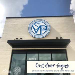
The facility also needed to upgrade and change the outdoor sign to match the new owner branding. We worked with the team to design elegant Saint Vincent de Paul logo signs to use on exterior and interior signs that would display their logo proudly. We built a push through acrylic logo for the front of the building, 6 feet in diameter.
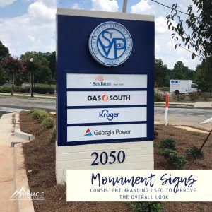
To provide new monument signage for the facility that included all the complexes tenants, we had to provide special fabrication to comply with city limitations. Best practice for monument signs is to install the sign perpendicular to the road of the building so it can be seen on both sides.
However, the site layout limited the sign to be put it on the corner. Our team had to develop a creative solution where we installed a normal front sign but a smaller sign on the side that could be seen from the other road even on an odd angle.
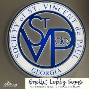
Finally, we created PVC letters in the food pantry area that directed people where to go for the different types of foods and then added a back lit lobby sign to the mix. The last touches will be functional in nature – naming rooms, offices, and exits.
More than just a visual impact.
In the end, this project had significance from both a visual improvement standpoint and philanthropic standpoint. While the surrounding area benefited from the visual improvement, the people in need benefited the most from the improvements.
After finishing up some of the minor architectural and construction details, the center will host their ribbon cutting on September 17th, 2020.
Learn more about the work and resources of St. Vincent de Paul Georgia by reading their website.


