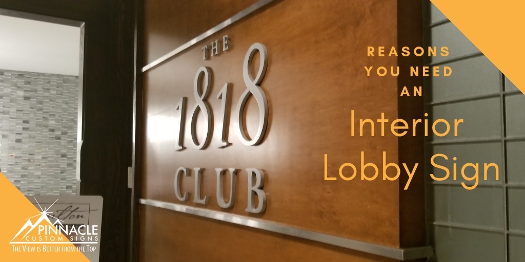
If the first thing someone sees when they walk into your business location is a blank wall, then you are missing a key opportunity to capture their attention and business.
Regardless of whether the person who walks through your door is a new or repeat client, your lobby sign should give them a sense of an established and professional business. The easiest way to do this is through utilizing a lobby sign.
Lobby signs help guest to know they are in the right location by identifying your brand. The design of the sign helps to establish the office atmosphere.
 Most importantly, though it may seem superficial, the professional perception of visitors and employees is more malleable than you think.
Signage helps to show that you are an established business and confirms longevity to your clients.
While making the decision to install a lobby sign is crucial, how you design it and where you locate the sign is equally important to making the right impression.
Tips for Designing Lobby Signage:
Your lobby logo should convey your brand and resonate with visitors. So, incorporate a few of these best practices:
Keep it Simple: All you need is your logo and company name if it is not part of your logo. If you want to add your tag line, that’s okay as long as it doesn’t overcome the logo.
Fonts: The entire point of a lobby sign is for your customers to read it. So make sure your font is legible. Using clean fonts is ideal when designing your lobby sign.
Size: Your lobby sign should be proportionate to the wall where you want to draw people’s attention. Make sure it is visible but not so large it is overwhelming.
 Ideas for Location:
Front Lobby: Although this one may seem obvious; your front lobby is the ideal location when it is a centralized space where all visitors and employees walk frequently.
Place the sign on the wall that is directly across from your doors so it can be seen from outside the building.
Hallway: If your office location doesn’t have a traditional lobby or reception area, then consider your hallway space. If your business is in a building with multiple offices, then placing a lobby sign in the hall can help customers find your location.
Reception Area: If your business has a reception area, then placing it behind the reception desk can help elevate the professionalism of your company.
Waiting Room: If your business has a waiting room, then taking advantage of your wall space can be two-fold. Since most people spend at least a short period of time in a waiting room, you can use the wall space to display your logo but also take advantage of additional information such as your mission, vision, or services.
Utilizing images by incorporating vinyl wall graphics can educate your visitors about your business while they wait.
 First Line of Sight: Sometimes your office space is not designed to have a lobby, waiting, or reception area. That doesn’t mean you don’t have a good location for a sign.
Consider wall spaces that are the first thing someone sees when they visit your office. It could be a larger sign on a large back wall or a smaller wall that is directly visible. There are solutions to create signage on doors and windows as well.
Sign Materials:
Materials for lobby signs can range from stainless steel, aluminum, brass, copper, acrylic, wood, plastics, and HDU. The material you choose may be dependent on the look you want to accomplish for you business. Lobby signs are perfect for illumination or backlit letters. However, some material choices are made based on longevity and cost.
Assisting you with material selection is where the team at Pinnacle excels. Our team can assess your chosen location and recommend signage based on size, look, and cost.
In addition, we provide site visits to determine the necessary installation materials necessary to hang or apply your sign on the chosen location. For more information on lobby signs or for a complementary consultation – give us a call!


