Marketing professionals and graphic designers around the globe understand the psychology of using specific colors in their designs. The same psychology used in designing graphics for ads and displays can be applied in designing signage for your business.
What Do Different Colors Communicate?
Look at the emotional impact of these color and consider how they can enhance your signage choices and help drive more traffic to your business.
 Red – This color tends to get people’s attention and hold it. Red is the color of power and the most popular color for marketing. However, don’t use too much of it or it can become intimidating.
- Yellow –Yellow can be considered a color of power, but it can also be a dangerous hue from a psychological standpoint. If you use yellow to command your audience’s attention and command confidence, then use subtle contrast to ensure that you don’t come across to strong and produce unsettling feelings.
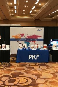 Blue – Blue should be used when you need to be viewed as a trustworthy company. When blue is combined with other complimentary colors it can result in helping your company stand out. PKF’s trade show booth is an example of how blue can convey trustworthiness, which is important for a consulting agency.
- Green –Green is warm, inviting, and leave customers with a pleasing feeling. It also denotes health, environment, and goodwill. Finally, green is the color of money, so it creates thoughts of wealth. If you need to convey versatility then use green in your design.
- Orange– Orange conveys energy and has powerful attention-getting properties. This color suggests fun and it makes customers feel as though they’re dealing with a cutting-edge company.
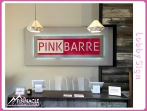 Pink – If you are marketing to the female demographic – you typically can’t go wrong with pink. Regardless if a female considers themselves a pink girl or not – this color attracts females on a psychological level.
- Purple– Purple is the color of royalty, which makes it perfect for lending a touch of elegance and prestige to your signage.
- Gold – Using gold in your design elements also suggests elegance and prestigious service but adds an element of power that is much stronger than purple. When you use gold in combination with purple or green, it creates a powerful color combination that symbolizes wealth and pedigree.
-

This routed building sign made from a combination of materials for Buckhaven Veterinary Clinic uses white text on a black background; the contrast makes it very easy to see. Brown– Brown gives customers a down to earth feeling. This color can create comfort and relaxation and is often used with another color for signage to help it stand out from its environment.
- Black– Black is highly versatile and can be modern or traditional, exciting or relaxing. Black is most often used as a contrasting color because it adds drama to whatever mood you want to cast. However, it can be used as the primary color in signage when used in contrast with white.
What does this mean for your business signage?
Most of the time a company uses the colors from their logo to represent their signage. However, it is possible to use the primary company-branded color in conjunction with a secondary color to command attention. Combining the brand image with a color strategy back by psychology can help businesses drive more traffic through their doors or attract clients who they might not have previously been able to capture attention.
With signage decisions that involve color theory and color psychology, a business can increase its exposure in focal areas that are core to the business. If you have signs that are in high impact traffic areas, then maybe red and yellow colors are needed in your sign design. If you need to give people a sense of calm and trustworthy experience, then maybe you should use blue in the design. Knowing how color effects the eye of the beholder can aid in a better return on investment of your signage.
Full Signage Design Team
Pinnacle Custom Signs has a full design team with multiple designers on staff to help you create a cohesive look using your brand colors and secondary colors to command the attention of your audience through signage. Just give us a call for a complimentary consultation for your next signage project.