VoiceNation has been the top provider of virtual receptionist services since 2002. Their company, which is located in Buford, GA, has evolved from being a virtual PBX and voicemail provider to a virtual receptionist leader, winning many awards for their exemplary accuracy, low hold times, and overall call quality.

Once they began answering live calls in 2009, there hasn’t been a day off yet. Their 365-day approach can be draining on the staff but they truly believe that every connection and every interaction is an opportunity to serve.
That is why the company invests in making sure to enhance the quality of life of employees while they are at work.
The VoiceNation team recently employed the services of an interior designer to enhance the interior of their office space with the goal of “sprucing up” a rather dull interior.
They realized that the majority of their workforce was stuck behind a desk for most of the day, and they wanted to make sure that space was more interesting and inviting.
Part of the new design plan included enhancing the interior walls with graphics. Elizabeth — the interior designer — reached out to our team at Pinnacle after a conversation with the owners to assist in this process.

Elizabeth learned of our long-standing relationship with the firm for signs and basic wall graphics in the past and she wanted to elevate the existing look with full on wall wraps.
Working on the Walls
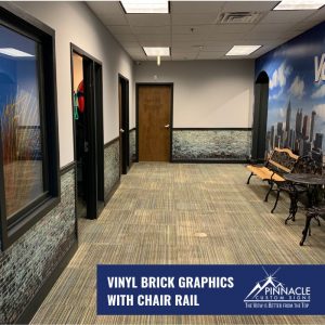
We worked with her to produce a brick wall look that was tinted with a hint of blue to coordinate with the office’s carpet. After installation, we trimmed the vinyl brick look graphics in with the chair rail molding to make them look as natural as possible.
The wall not only featured a brick look but showcased color blocks that highlight VoiceNation’s core values in areas such as Respect, Fun, B.O.B., Ownership, and Essentialism.
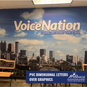
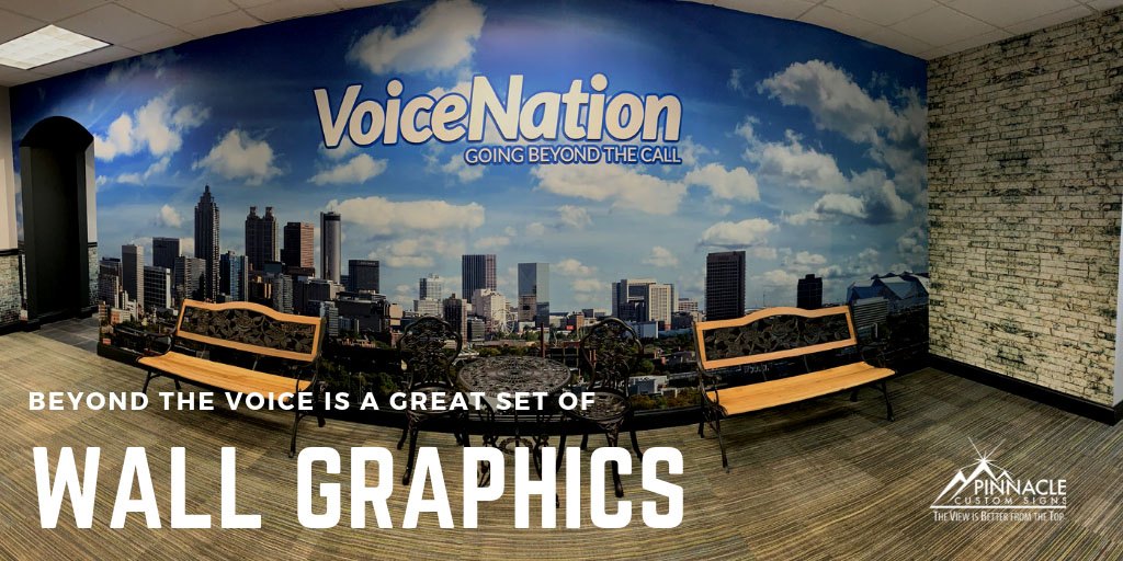
Next, we actually covered the plain logo graphics we had installed for them just a short time ago with a large Atlanta Skyline mural in the lobby.
These graphics included a dark blue border that was used to offset the new a Voice Nation PVC dimensional letters logo. The dark blue was used as a shadow of sorts to help them stand out from the cloud filled skyline.

Our team generally uses a vinyl pattern when installing PVC dimensional letters, so instead of using a temporary pattern, we set the dark blue vinyl to have the interior section cut out to show where the letters were to be applied to the wall.
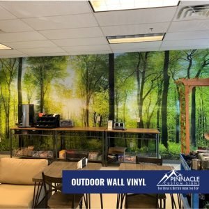
Finally, we installed a nature themed wall wrap in the break room to enhance the feeling of the outdoors in a work environment that is not conducive to getting outside as often.
Graphics as Art
Many companies are invested in creating enhanced spaces that help their employees feel more comfortable and help increase productivity. Our staff has seen an tremendous increase high-level custom work where we will design, manufacture, and install custom projects. On projects like this, it helps to work with a client through how the graphics can impact their space. In the case of VoiceNation, the Interior Design team did that for us!
If your office environment needs to be enhanced but you don’t know where to start — consider things in a narrative form. Is there a story you can tell? Do you have core ideals you want to reiterate? Do you need to bring more light or the outdoors to life?
If you ask yourself those questions and still aren’t sure – give us a call! We would love to work with you on a consultation to enhance the quality of your office environment.


