One sign of a successful business is when you’ve outgrown your space and need to move your business to a new, larger facility. Once you’ve determined the location and arranged for the typical things needed for the move, such as power, utilities, and floor plan, you will need to figure out what you will need to do about your signage.
Can you use your existing signage? Will it be adequate for the new space, or do you need something a bit larger? Are there any other new signs you will need? These are just a few of the things to take into consideration, as well as the appropriate permits, designs, costs, etc.
Things to Consider When Relocating a Business
These were a few of the questions that Clarity Vision Group was considering when they first reached out to us in early February. When we first met Ric Sol, he told us that they were moving to a new location in Cumming, GA that was almost three times as large as their current store.
Moving their Channel Letter Sign
Clarity already had a channel letter sign on their existing business, which just provided the name of the business. But with the larger space, they had additional “real estate” that they wanted to take advantage of to give customers a better idea of the type of business they were. They wanted to add the text “Optometry/Eyewear” to the sign, letting people that not only did they provide optometrist services, they also sold eye wear.
While this seemed to be pretty straight forward, we went through several iterations to make sure that the final product could fit and be clearly visible for all to see. Fortunately, we were able to rearrange the original sign to accommodate the addition right below it and have it all fit on the stucco above the awning over the front door.
 A New Lobby Sign & Interior Signage
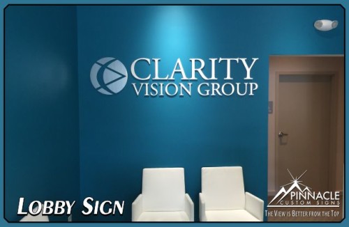
After finalizing plans for the channel letters, the next part of the project was to work on some internal signage. Ric wanted to get something “impressive” for the focus wall at the new location.
We provided him with a couple of options, but the one that seemed to work the best was ¼” PVC lettering with a brushed aluminum veneer. The plan was to put it on a bright teal-colored wall. The silver veneer seemed to pop off this wall, making a bold and clean impression.
We also provided them with several interior ADA signs to label the rooms, similar to the ones we make for Georgia State University.
Exterior Hours of Operation & Doctor’s Names Sign
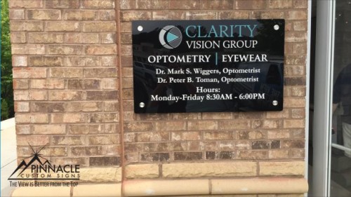
Clarity wanted to have their hours and doctor’s names displayed on the exterior of the building. We typically put these on the door of an establishment using cut vinyl lettering, but this was not the case this time due to the nature of the windows used in their storefront.
Instead, we mounted a piece of black acrylic to the exterior of the building with tamper-proof standoffs and matte-laminated vinyl. The finished product gave a touch of elegance to the exterior of the building, and differs from the typical white lettering found on most establishments.
In summary, when moving your business, there are many options for your signage. In this project, we were able to use existing signs as well as create new signs for this customer. If you are planning an upcoming move of your business, we can help you determine what would work best for your particular circumstances. Fill out the form below to contact us and find out how we can help.


