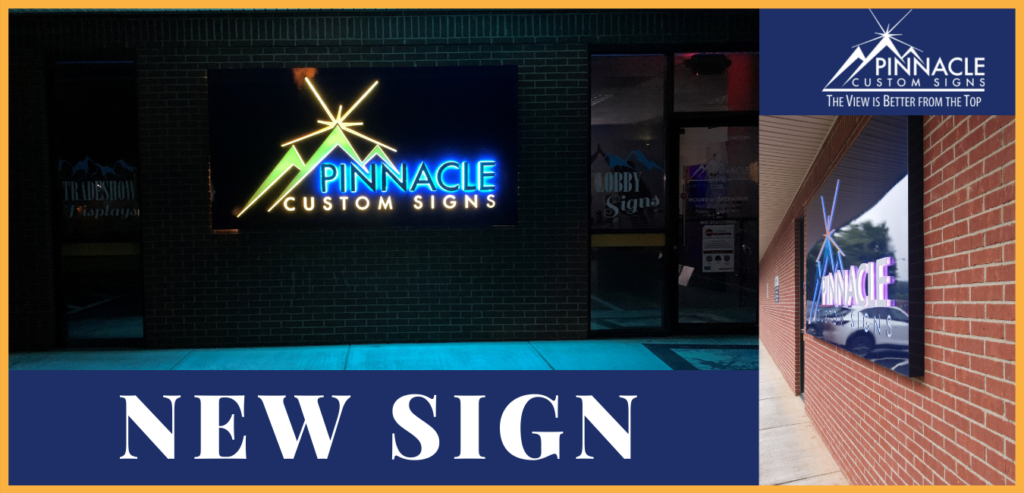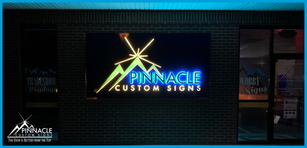
For the Pinnacle Custom Signs building sign, we decided to make something a little bit different.
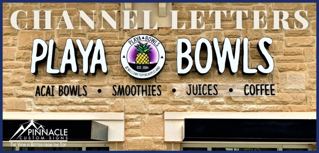
The signs we typically do are channel letters which everybody sees all day long, along with lighted cabinets. We saw this as a chance to showcase our abilities and the different techniques we use when working with aluminum and acrylic. We took all elements of our logo and decided to showcase three different techniques we use for lighted signs.
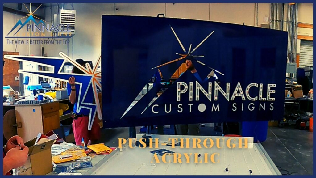
One technique would be the push-thru acrylics, lettering.
An example of push-thru acrylic is where the mountain logo pushes thru the aluminum by a half-inch and has a print on top. The sides of the mountain illuminate. This gives the sign dimension and greater readability when done right.
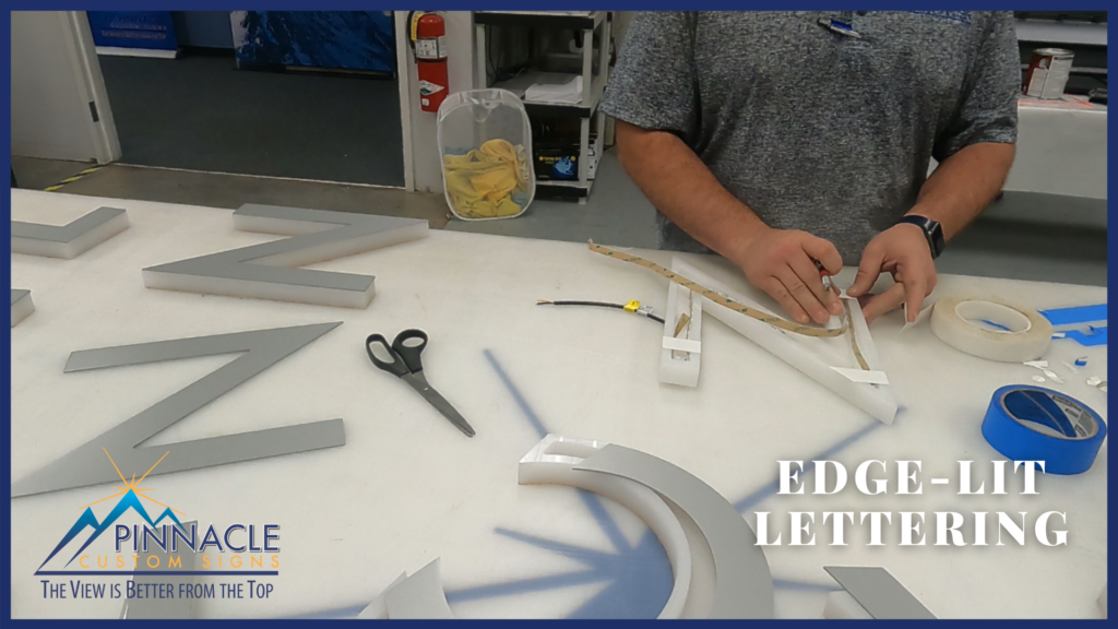
Secondly, we use edge-lit lettering.
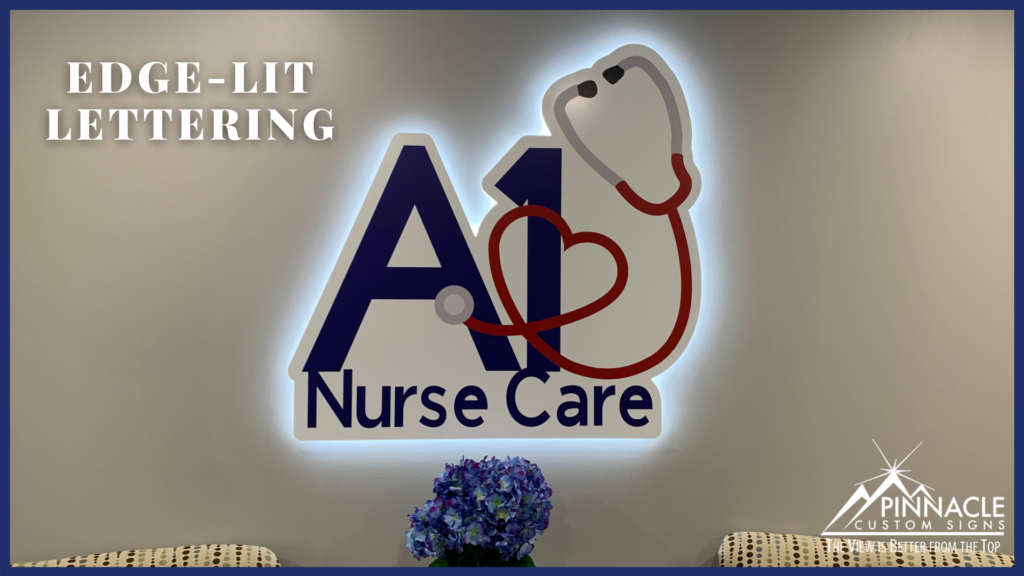
We have used this technique previously for customers, A1 Nurse Care and Knight & Associates. The acrylic is one inch, a channel is routed into the letter. We place LED strips inside of it facing outwards to illuminate the edge of the letter.
The one-inch reveal gives a nice glow while the faces are topped with an eighth-inch aluminum. This aluminum shields the light from coming up the face and creates a halo effect around the edge of the lettering.
The last piece we used was what we like to call a pierce-faced sign. The aluminum is routed out and backed with acrylic.
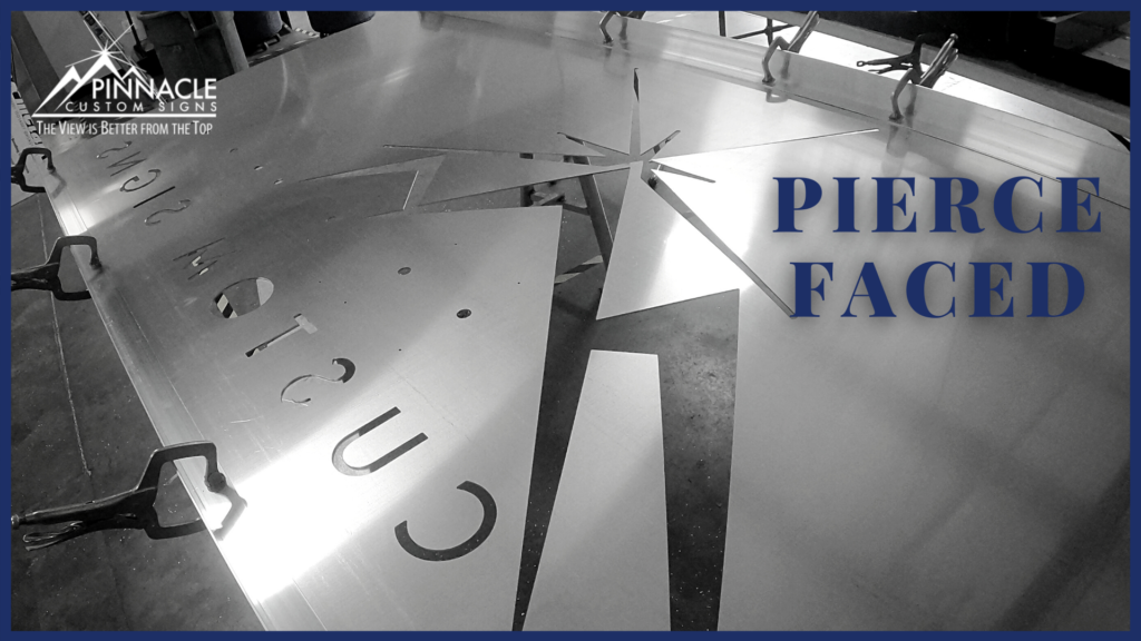
We used this technique to create the same look as a push-through sign with a little less cost. Because we use a thinner acrylic that doesn’t have to be routed and pushed-thru aluminum, the sign still has a nice appearance and gives the customer options to meet their price range.
Rather than doing channel letters or a lighted cabinet, we decided to create a new look we believe are the best-looking signs at the highest value to the customer.
