A Somewhat Virtual Tour of Our New Facility
As you know, the sign industry is very visual in nature. Everything we produce is meant to be seen by someone and to draw attention to a business, event, etc. One of the most frequently asked questions we get when we tell someone we own a sign company is, “What kind of signs do you make/sell?”
 One way to answer this question is by showing our capabilities using examples around our showroom that would educate visitors. Seeing examples of the types of work we can do, helps customers visualize how we can help them with their project. One of the goals for our Grand Opening celebration was to show those who were not familiar with our work what was possible.
A majority of the decorations in our new home take advantage of wall graphics; however, there are other examples as well. We spent time to identify the purpose of each area and what it would teach our customers.

On another nearby wall, we decided to show the different types of vehicle graphics that we do, since not all of them are wraps. We had a bit of fun with this one. While we tried to also maintain the mountain theme to a degree, for this we used a ski resort flair.
If you’ve been skiing, you know that there are different levels of ski trails, depending on the terrain. So, we took the different levels of vehicle graphics and named “ski runs” identifying the level of graphics associated with each such as: Rear Window Perf Trail (a ‘green’ run), Logos & Lettering Run (a ‘blue’ run), Partial Wrap Express (a ‘black diamond’ run) and Full Wrap Canyon (a ‘double black diamond’ run). We also included a cutout picture of a vehicle next to each run showing an example of that type of job.
In another area of the showroom, we wanted to focus on how we can help customers with their trade show needs. So, for this, we set up a trade show display, complete with a table having a branded table throw and your typical trade show give-aways. For this area, we also used a wall graphic that gives the feeling of being on a trade show floor.
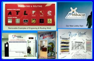
Finally, the showroom also has what we are calling our “Design Center”, showing the elements needed for good sign design such as color combinations, font choices and color charts. The final wall in the showroom is slated to show our outdoor sign capabilities, but we haven’t gotten that one done yet.
 In going back to our production area, where the magic happens, we have our “Mission Control” showing our production schedule and also reminds everyone of our mission statement. We have also created a lobby sign of sorts with removable examples showing the different routing and engraving options found on the outside of that production area.
We still have more work to get things finished the way we want to have them and look forward to the challenge of creatively showing more of what we do.


