Smart Source — who daily seeks to become a resource for helping their customers deliver more intuitive communications — understands the importance of making sure they are sending the right message to their customers. The company has long been recognized as a leader in providing customized technology solutions to help their customers improve processes, reduce cost and more effectively communicate with their customers.
That is why Kasey Anderson and Stephanie Boyd contacted Pinnacle a few months back during the acquisition of the Data Supplies off McGinnis Ferry in Suwanee.  One Of The Steps To Rebranding A Company Is SIGNS
They wanted to be prepared for the signage needs of the location during the procurement process and make sure that they were effectively communicating their new message as well.
Anytime we conduct a sign re-branding project, we need to look at the existing signage to be able to determine if we can simply replace what is already being used or if we need to do some modifications so that our clients are receiving the best possible outcome once the install is complete.
Stephen and Matt had a chance to go out to the location and meet with Kasey and Stephanie, once the transition was complete between the two companies . After conducting a site visit to look at the project, we were able to give a better answer on what it would take to convert the existing Data Supplies signage into Smart Source for both the interior and exterior branding transformation.
Rebranding a Company – Exterior
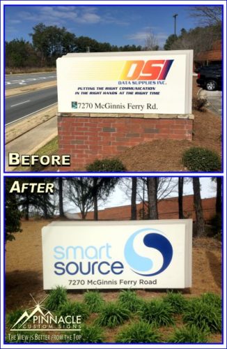
The existing monument si gnage for Data Supplies was the first challenge. Stephen knew that if Pinnacle simply replaced the signage decals on the aluminum monument there would be ghosting or remaining traces of the previous sign.
The simple solution for this problem was to remove the old vinyl and sand down the old paint. Once the old was removed, we could paint the aluminum monument and add the new decals for a overall fresh and clean appearance.
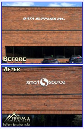
The second exterior signage overhaul was the dimensional lettering on the front of the business. Pinnacle removed the existing lettering and replaced it with new brand specific letters and logo that help the signage stand out more from the brick store front entrance than the existing lettering. 
Rebranding a Business – Interior
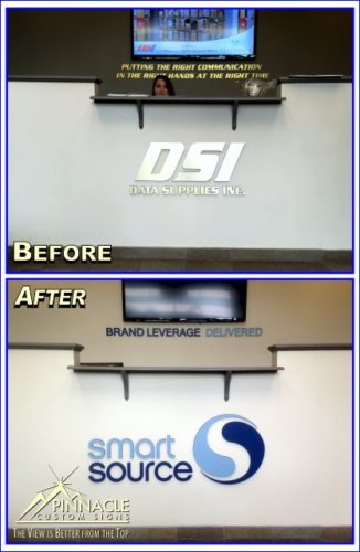
The next main point of focus that Smart Source needed to update to re-brand the business was the interior signage inside the front lobby. The previous lobby signs had simple silver logo at the front counter with gold lettering on a dark background behind the desk that did not blend well with the new brand image.
Stephen and Matt quickly suggested using the full color logos in front of the counter to add an immediate pop of color. In addition, after they painted the back wall a shade lighter we were able to use the same color palette and replace the existing gold lettering tagline with the new simple, sleek, and eye-catching tagline in the logo colors.
If you have a project where you need to overhaul your businesses look, give us a call or click here to fill out our quote form.


