In March of 2014 we were contacted by Bartow Rainey of the FRED Agency. FRED is a boutique agency headquartered in Atlanta specializing in new media, brand strategy, marketing and award-winning design. They were contracted by the new owners of Hannover Grand at Sandy Springs and asked to refresh the look of the complex and create an appealing new brand that would attract new residents to their apartments. The existing signage on the property was old and worn and made the property feel that way.
There was a sense of urgency on this project since the sign company they had been working with on this property could not handle this project for them. We jumped right on it and designed a three phase implementation that would best serve to complete this project.
The first phase, as can be seen to the right, was for signage used to identify specific areas of the complex or direct people to specific areas. These included:
- pool rules,
- fitness center identification,
- fitness center rules,
- directions pointing to the apartment units,
- the location of the leasing center,
- directional entry signs, and the like.
We made these signs out of a variety of materials. Many of the informational signs, were made using vinyl prints on poly-metal (also known as dibond) which would allow for more decorative look. The directional signs pointing to the apartment units, which were simpler in nature, were constructed of routed and painted High Density Urethane (HDU) giving them a more dimensional appearance.
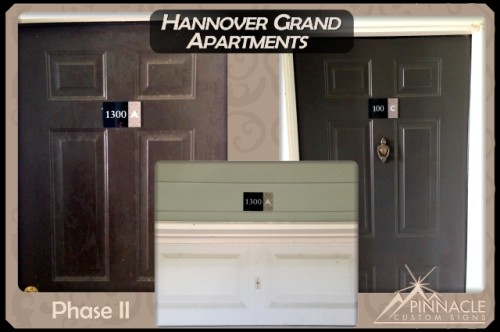
The second phase was parking space identifiers for their garage, which included both interior and exterior signs. These were made of back-painted acrylic and had to be outsourced by one of our partners, Signs for Success, out of Spokane, Washington, who was able to produce these signs using their flatbed printer.
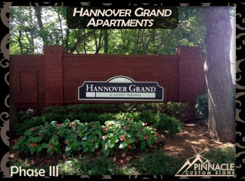
The last phase of the project was to replace their entrance signs that were over 9 feet wide by 3 feet tall. Since they were replacements, they had to be shaped fit into a specific space fit into the existing brick wall. These were also made of hand painted HDU due to that material’s ability to withstand the elements. The complex entrance now has a more stately appearance than it did before the update.


Phase One of the project was completed in April of 2014, Phase Two in May, and Phase Three in late June. We were able to coordinate with the FRED agency and create the property signage they were looking for to rebrand the apartment complex. The coordination with our suppliers and with the marketing company was also critical to our success.


