What do customers see when they walk into your office? And, how do they know they’ve reached the right office? A lobby sign gives your office a professional and polished look and clearly identifies the business working there.
Lobby signs can be made from a variety of materials. They can be as simple as just putting cut vinyl on the wall behind the receptionist’s desk. Or, they can be more complex and dimensional designs made of materials such as metal, acrylic, PVC and vinyl.

At the end of February, John Wilson, from Valeo, contacted our sales team with an inquiry for a new Lobby Sign. Stephen met John in the Hurt building in downtown Atlanta, where the Valeo team had recently relocated their offices.
At the meeting, they discussed different options for lobby sign materials and Stephen showed John sample materials and pictures of our previous jobs to give a sense of how the materials would look in the finished product.
When Stephen got back to the office and put the work order into design, the fun began. Josh was assigned to create the design for this project. They discussed giving Valeo several options as a starting point, since at this stage, they were not sure what materials they wanted to use.

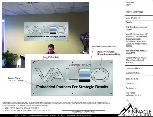
In our first proof, we provided three different options for the lobby sign. All three incorporated different dimensional aspects. Each one had dimensional letters routed from ¼” black PVC with a brushed aluminum face, except one letter, which incorporated their logo into the design.
The Interior Office Sign
However, what made the three options different was the way they were mounted to the wall:
- In the first option, each letter would be directly mounted to the wall.
- The second option had the letters mounted to a ½” black PVC backer mounted to the wall with silver standoffs.
- Finally, the third option had the letters mounted to a 3mm brushed aluminum poly-metal backer instead of the black PVC, also using silver standoffs to mount to the wall.
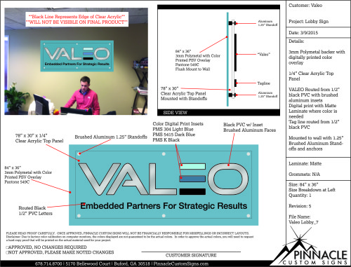
John took some time to review these options with the team, and decided to move forward with a completely different approach. Rather than a black PVC or brushed metal backer, they wanted the backer to match a specific Pantone color from their business card. They felt this would stand out from the wall and incorporate their corporate colors into the design. Josh decided to take the poly-metal backer and switch it from a brushed finish to one using a vinyl overlay to achieve the specified color.
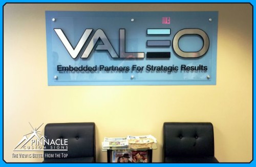
After John took this to his team, they found an example of something they really liked on Google. The design was very similar to Josh’s design; however, it had another dimensional piece to it. They decided to have the Pantone poly-metal backer flush mounted to the wall and a clear acrylic back panel to hold the dimensional letters, giving the sign a fifth dimension.
Matt and Stephen installed the sign at the beginning of April and the Valeo team was ecstatic about how the sign looked. Over all, the design from start to finish underwent seven changes to create the perfect sign which is truly unique to the Valeo team.

Do you have a vision for a lobby sign you’d like to have specially created for your business? We would love to help make that vision a reality. Please fill out our quote form for help.


