One of the first things a new business owner thinks of when it comes time to start designing exterior signs for their business is how they can get their logo on the sign in order to build brand awareness. And, more often than not, they want to make that sign as large as possible to make sure the new sign has maximum visibility. Size is typically dictated by the sign ordinances for the specific municipality the business is located.
What are the sign Ordinances
Unfortunately, not all jurisdictions define the maximum size of an allowable sign in the same way. Some define it based on the square footage of the building (or suite), while others define it as the square footage of the building facade, and almost all have some sort of maximum allowed dimensions.
However, in most cases, when defining the maximum size, it is often determined by drawing a rectangle that encloses the entire sign that is used to determining the square foot area of the sign. Because of this, you want to be sure that you don’t include design elements that might “eat up” this area causing your sign to be ineffective.
A Case Study: Secur-A-Maid
Secur-A-Maid provides residential and light commercial cleaning services. We met Karen Post, the owner, through a few networking groups we both attend. In the past, we have helped them by adding graphics to the vehicles their crews use when going from job to job.
However, this fall, they moved their headquarters to a new location in Buford and they now needed a new lighted channel letter sign on the outside of the building. As with most businesses, the most obvious choice for this type of sign is to use the business’ logo.
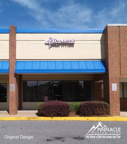
 Their logo features a “sheriff’s shield” at the front, with the Secur-A-Maid name coming out of the star. In Buford, the maximum allowable business sign area is 5% of the face of the building. So, to measure the size of the Secur-A-Maid sign, the height would be measured from the top of the star to the bottom of it and the entire width, from the leftmost point of the star to the “d” in maid, and had an area of 15 square feet. (See the original design here.)
Unfortunately, once the business sign was installed, Karen was disappointed by the size of the sign, as the name of her company was not as visible as she would have liked it to be. Due to the size of the star in the logo, the text could not stay in the proper proportion for the logo and be as large as she would have liked it to be.
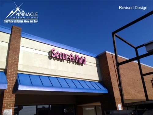
We then went back to the drawing board and suggested that if we removed the star from the logo, we could make the text considerably larger. As you can see from the second proof, the new business sign is definitely more visible and stands out more than the first exterior business sign. And, not only that, the sign is actually a tad bit smaller in total square footage than the original (measuring in at 14.7 sq. feet).
As you can see, sometimes you might have to sacrifice some design elements that you would like to include in your new sign in order to have an effective sign for your business. In this case, the sign could not be true to the logo in order for it to be highly visible. Designing exterior signs is sometimes both an art as well as a science in trying to maximize size while keeping within the boundaries of sign regulations. Our team is quite familiar with the various sign ordinances and can provide you with advice on how to maximize your sign to stay within these regulations.


